SANCTUARY ON SOLANO
Design matters. It’s worth it. Get it wrong, and it can cost you hundreds of thousands, unnecessarily.
This home was a spec home that sat on the market for two years, never occupied, because of bad design. After losing 60% of its value, a repeat client of mine picked it up, and called me to say, “Let’s make it right..” We tore out at least a half-million dollars’ worth of wasted work (and that was just the exterior) and brought it back to dirt.
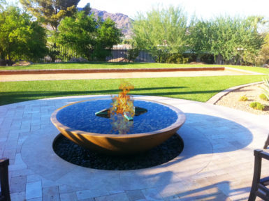
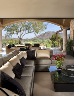
My favorite thing to point out about the previous design was the bbq, situated directly outside of the 20’ sliding door, bouncing the glare of sunlight directly into your face. It also occupied the best seat in the house, where you wished you could sit, looking back at Camelback Mountain. Sorry. You can’t. That’s where the barbecue goes…Really?
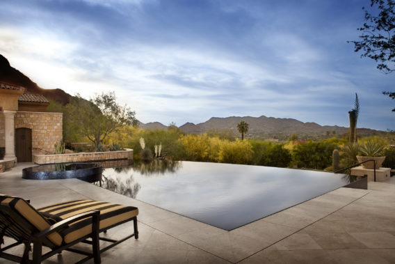
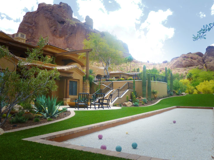
The first thing we needed to address on this property was to get rid of the noise around the perimeter. We planted trees downhill from the house that would screen out the roof lines in the foreground, allowing one’s gaze to go unimpeded to the mountain horizon vista, without distraction.
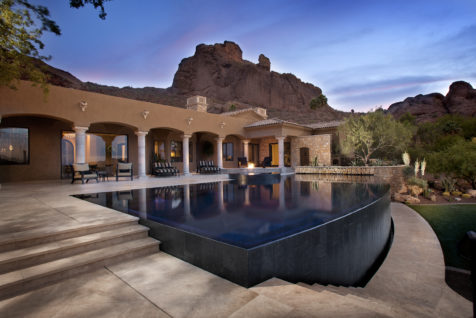
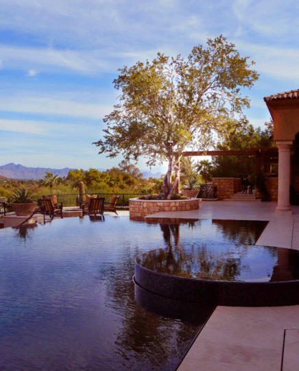
Within the space, we brought in two mature Ironwood trees, carefully selected for their sculptural and upward branch structure, to provide shade and an overhead sense of space without obstructing any views. Once situated we knew where the pool could go.
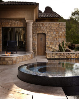
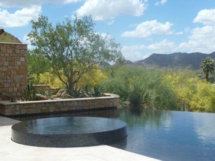
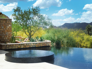
The glass tile spa was situated to be the jewel you viewed in the foreground, enjoyed right off the master bedroom and the home office.
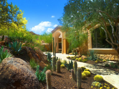
A cluster of saguaro cacti in the middle ground became the art focal point when you enter the front door.
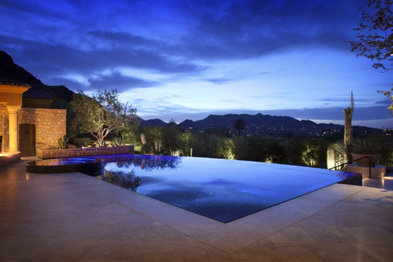
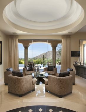
The curvature of the vanishing edge pool had its center point located within the foyer turret, so you get a subliminal sense of its revolving around you as you walk into the house for the first time. The horizon line it established was set out far enough that it bounced one’s gaze to the background layer, the mountain vista, and the glorious sunsets beyond.
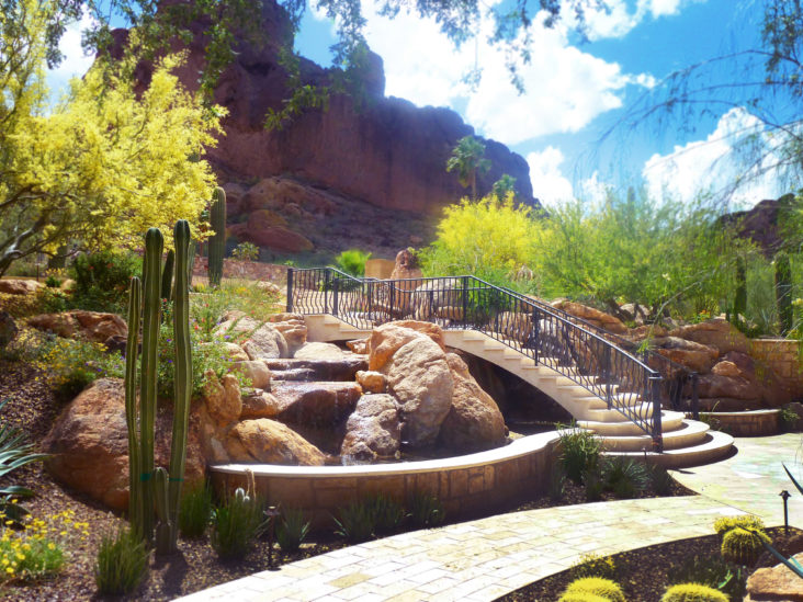
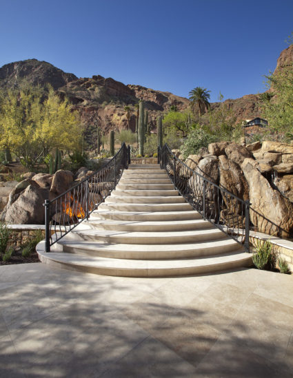
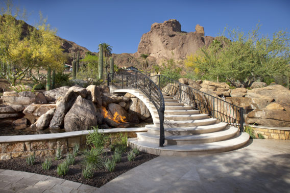
The front entry water feature was reworked, as well. It had an identity crisis. One half was man-made, the other half was trying to be natural. We tore out the man-made side and brought it over to the natural. We brought the front entry approach directly over the natural waterfall, in a bridal-train-flowing stairway, reminiscent of Michelangelo’s Laurentian Library in Florence.
There is a monetary return to good design.
It’s not just about aesthetics.
Do It once. Do it right. Enjoy the return for decades.
LET'S TALK ABOUT YOUR NEW OUTDOOR LIVING SPACE.
Would you like a complimentary copy of Kirk Bianchi’s 32 Design Principles?
This book of principles captures the elusive qualities that separate what is esteemed from the mundane. They elevate even simple projects to an art form.
Those who have studied the arts know these fundamentals; yet the finesse of implementing these insights consistently takes rigorous application few have attained. The masters integrate them intuitively and now you can have them at your fingertips.

