Harness the power of reflections to maximize emotional impact
WHY ARE REFLECTIONS so compelling? We see them used to powerful effect in poolscapes today and in the world’s most famous bodies of man-made water, such as the reflecting ponds in front of the Taj Mahal and the National Mall in Washington, D.C. Yet even in their most iconic applications, the exact appeal of reflections remains somewhat elusive.
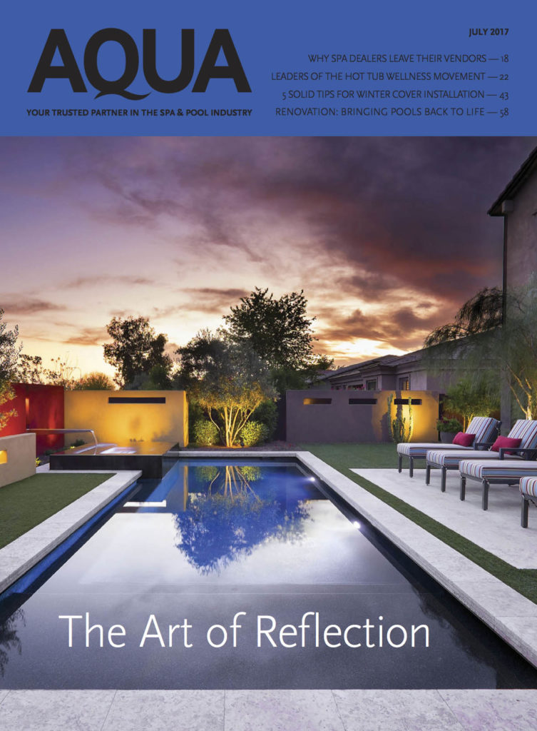
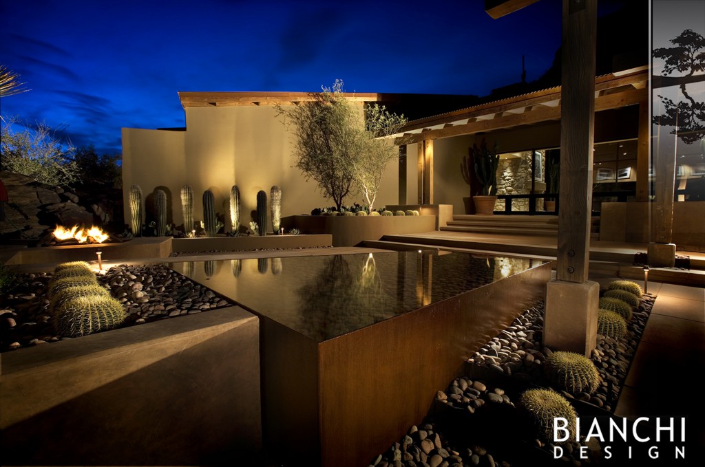
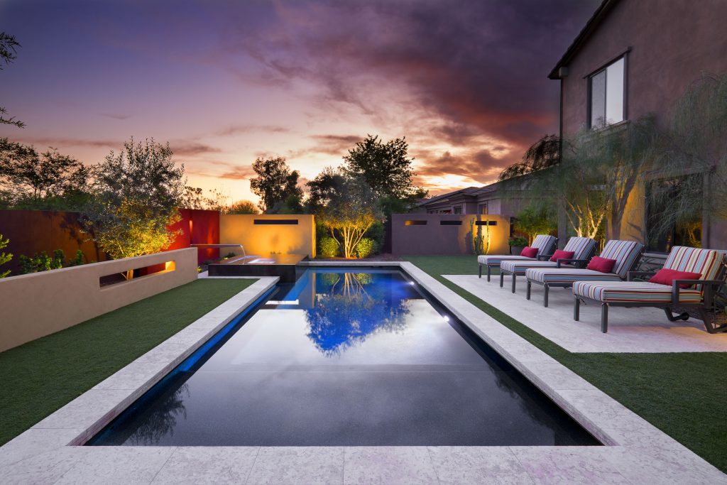
A mature ironwood tree was selected for its sculptural form, and serves as the reflected focal point enjoyed from all of the home’s views. Primary colors were woven in to elicit a higher energy vibe, in keeping with the client’s request for “hacienda modern.”
My personal theory is that it comes down to two primary factors: First, reflections present an inverse image of the surroundings. You might be desensitized to seeing something beautiful to the point you don’t notice it anymore, but when you see the same thing inverted in a reflection, the shift in perspective catches you unawares. The element takes on new meaning and has a fresh, enhanced impact. Second, the smooth reflective surface needed to get the reflection subconsciously signals that the water is tranquil, which calms down our nerves.
Still water, still soul.
People come to the water’s edge for that sense of peace and comfort. Reflections by their very nature inherently convey that quality in a visceral way.
THE “AHA” MOMENT
As designers, we’re working toward that big moment when all the elements come together to create a finished environment. We can do our level best to predict and project the completed scene using drawings, photos and computer renderings, but ultimately, the whole process is a leap of faith that the final result will be better and more exciting than what we and our clients imagine.
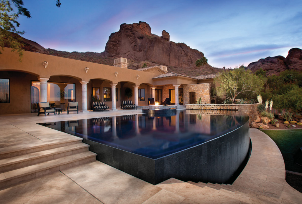
From the fire pit destination, the pool mirrors the architecture of the home and also a strategically placed ironwood tree, held in place by rugged stone walls that serve to bookend the room. The composition as a whole bounces your eye to the iconic praying monk outcropping and head of Camelback Mountain.
That moment when the water is in the pool and it all comes together is the big payoff for what has been an expensive, complex and in many ways disruptive process. We spend weeks or even months looking at the concrete structure and the various levels of chaos that attend the construction process.
During that time we’re imagining how the materials, colors, shapes, proportions, spatial relationships and landscaping will all conspire to create something beautiful. As the work nears completion we can start to see the eye candy developing around the pool, but in reality, it’s not until we see what the water itself adds to the scene that we can truly grasp the overall visual impact.
If we’ve done our job correctly, applying tried and true design principles to how we proportion and organize the space, the impact in that first moment when they see it full will excite the clients like their first ride in an a glass express elevator. What was previously mostly only imagined all of a sudden becomes realized. To a very large extent, it’s the reflections that deliver the wow factor.
COLORFUL DISCUSSIONS
For all of the elusive and even mystical appeal of reflections, there are still very specific ways of designing with reflections in mind that we can apply to maximize the effect. Inside the pool itself, I always make the interior surface color a big part of the conversation with clients. Oftentimes, they simply are not aware that going with a darker color will dramatically support reflections. Instead many tend to think that darker colors will look murky, which is all part of why light colors or even pure white are still popular.
While dark interior colors make water more reflective, vivid colors and/or bright illumination are the finishing touch needed to get subjects to “pop” and show up well in the reflection, even if the water is disturbed.
So there’s an education process we often go through as we explain the range of color options and why thinking differently about color — and specifically, choosing a deeper one — will create a powerful effect that’s difficult to fully anticipate until all the visuals are locked into place. Generally speaking, I don’t go any lighter than sea-foam green, and generally, I prefer to go with darker colors. It’s important that the colors are selected from the palate the site and surrounding materials suggest, with greens being by far my favorite. I don’t necessarily default to using black, although it can look great in the right setting and delivers the most intense mirror effect.
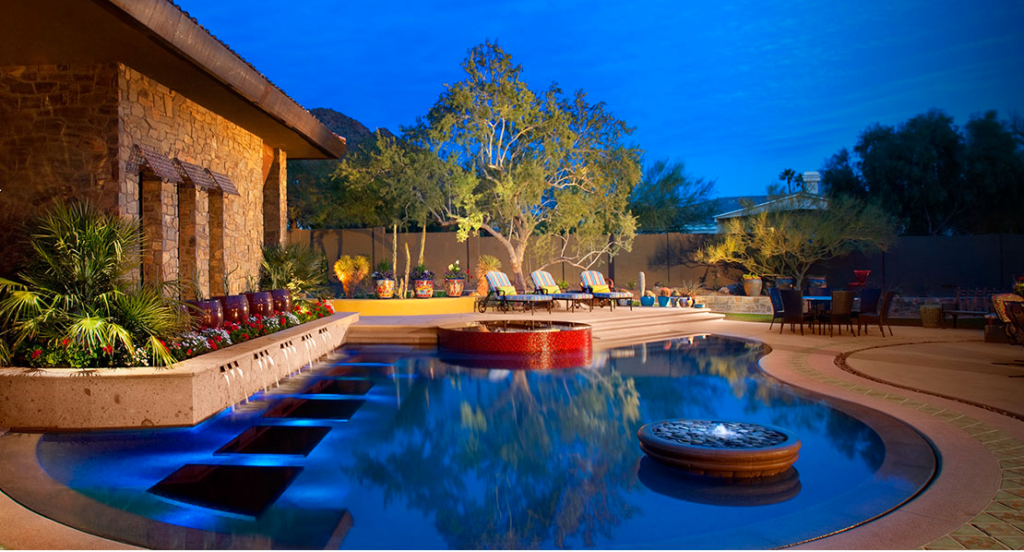
Turtle bay for “green” and ocean blue (when there are a lot of grey tones in the surroundings) are go-to colors that I use a lot. Bordeaux is a great color when the site has a lot of warm desert tones in the vicinity.
(As an aside, I too am one who loves to use greens when there are enough greens in the surroundings to draw from. The idea that they make the pool water look like it’s riddled with algae just isn’t true. Instead, greens create a soothing family of hues that look great reflecting landscape and architectural elements. When reflecting the blue sky the effect is a beautiful aquamarine color that is extremely inviting.)
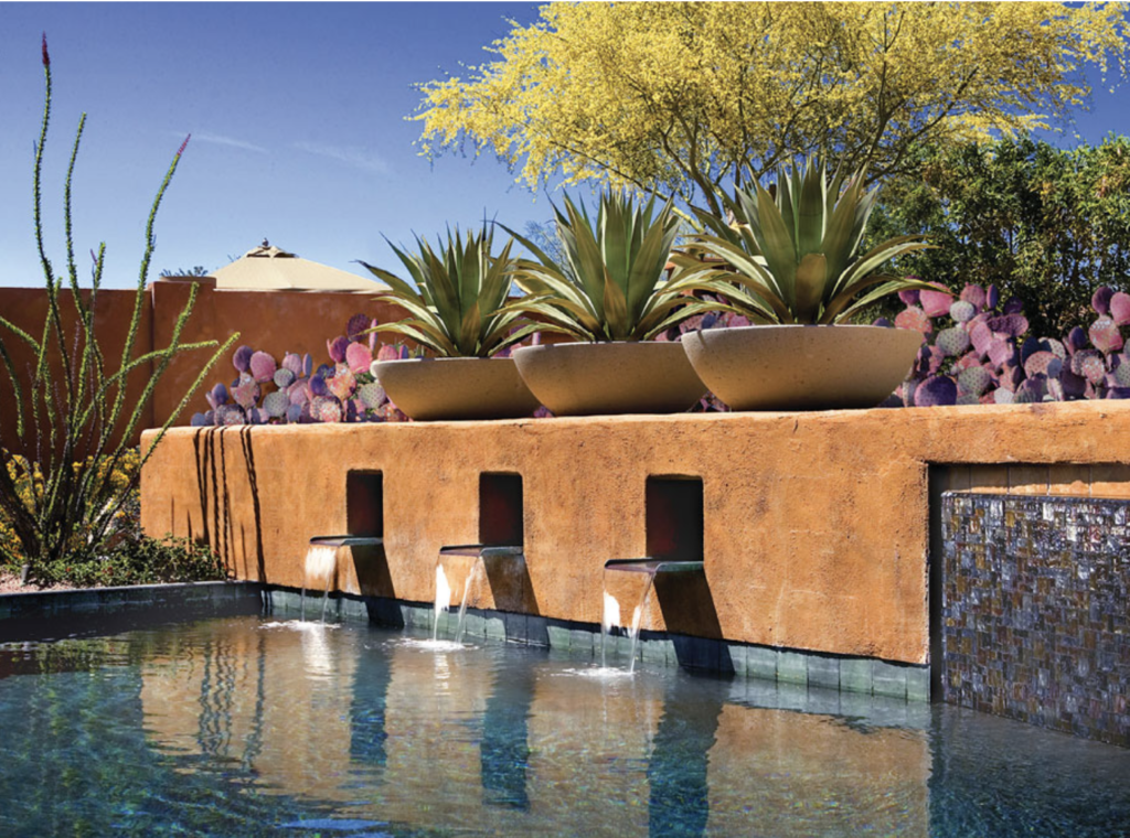
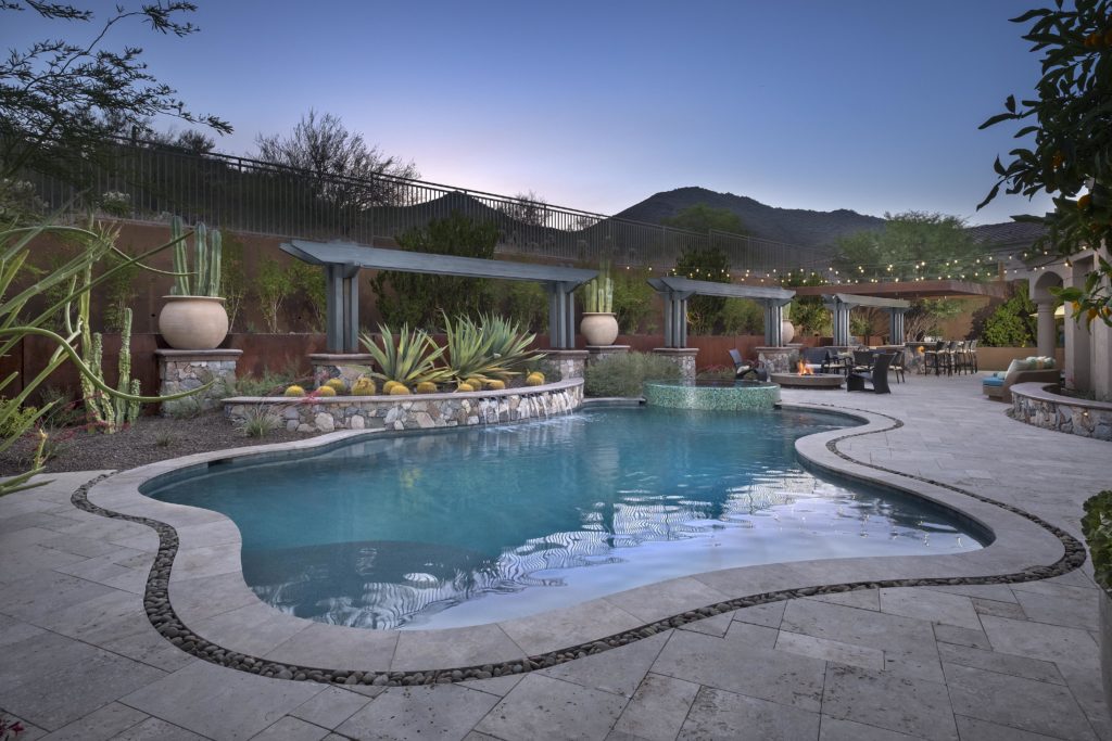
The goal for this project: bring the mountain and desert back- drop into the backyard seamlessly. Mature trees were set inside the rebar fence to blur the line from inside to out (and to reflect of course). Having just the right angles and heights to capture the reflection of the peak itself was a delightful surprise bonus.
When clients gravitate towards a lighter color, like sea foam, I make sure to show them visuals that demonstrate how they’re trading the intensity of the reflective character for an effect that is more about the water color itself. There’s nothing wrong with that — it’s just a different mood that you want to do on purpose. If you go any lighter than a mid-range tone, however, you will be vulnerable to having the pool look like a bathtub. Instead of reflecting, you fi nd yourself looking down into the vessel itself. (That works well in Mykonos, for different reasons. There, the effect is to create a pristine, crystal-clear, spa-like feel, and it does that well, but reflections are sacrificed as a result).
Once clients see the value of reflections, they appreciate the recommendation to shift to mid-range and darker colors. They fall in love with the reflections and the heightened awareness they bring to their setting.
TREATING EDGES
One way to consider reflections is to think of the water as a picture placed in the yard as a deliberate and distinctive work of art, a way of displaying a mirrored rendition of the immediate surroundings. As we know about pictures and paintings hanging on walls, the frames that surround them can change the way we see the image contained within the boundaries.
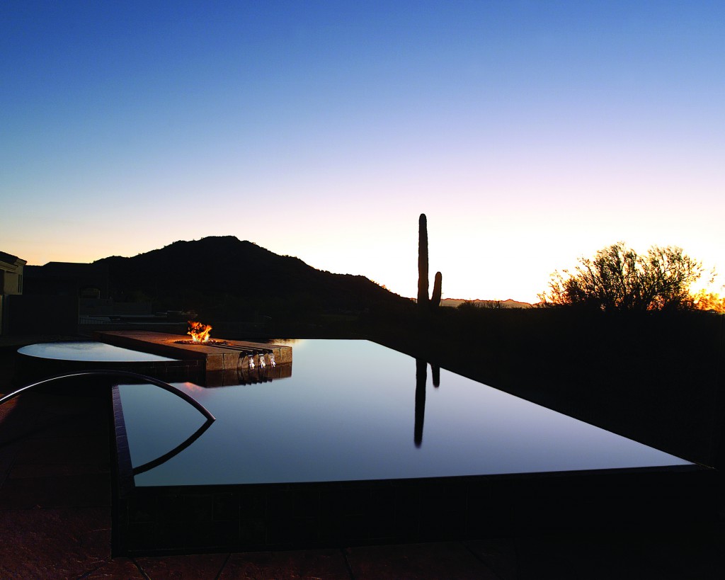
We called this project “Slice of Sky.” The mountain and landscape beyond are left dark so as to distinctly frame the pool that mirrors only the western sky and one lone saguaro.
In pools and other bodies of reflective water, the edge treatments are the frames.
There are infinite types of edge treatments: tile, coping, raised-edge details and cantilevered decking as well as vanishing edges and perimeter overflows. Within that tremendous variety, all edge treatments, more or less, fall into one of two categories.
First are the edges that create a visual border. It’s important to keep in mind that with reflections of edges, you are in effect doubling the width or amplitude of the edge. In other words, if you have 4 inches of tile line above the water’s surface, topped by 2 inches of coping or deck material, that creates what reads as 12 inches of border that separates the reflection from the environment around the pool.
Or if you have a raised spa that is 18 inches above deck, it’s going to be 24 inches above the water, and then when you add in its reflection, wow. It’s a block 48 inches tall in the scene. That can be heavy. Lower that spa! Less is more.
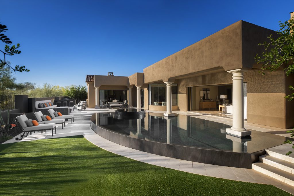
This midnight blue Pebble Tec Pool provides just the right depth to reflect the columns and open air living spaces while delivering a deep aqua blue-green from other vantage points.
Using the doubling effect can be a wonderful way to draw attention to features around the perimeter, be they architectural details or landscaping you want to accentuate. On the other hand, if you don’t think it through, the thickness of edges reflecting in the water can inadvertently shrink the pool visually and be an unpleasant division. Also, edge reflections can provide important visual transitions to surrounding structures that essentially lead the eyes through the composition.
The important thing to remember is that with reflections, you always amplifying the visual impact by a factor of two.
Water-in-transit details — i.e. vanishing edges and perimeter overflows — provide the opposite effect. Like a painting hanging on a wall with no frame, these clean knife-edges make the image standout purely on their own aesthetic merit. The edge quite literally vanishes, leaving the reflection to dominate the scene. Unsurprisingly, water-intransit edges work particularly well with contemporary design motifs, which typically favor clean lines and distinct visual boundaries.
Sometimes, when standing by a pool with a vanishing edge or perimeter overflow design, one gets a sense of vertigo that makes the image in the reflection even more dramatic. It’s like cutting a hole in the earth and seeing a piece of the sky beneath you instead of above.
SENSE OF PLACE
Perhaps the most significant aspect of reflections, and how to work with them, is what they mean in context of the overall setting. I’m among those who believe that pools and hardscapes should integrate with the composition of the surroundings, and they should amplify one particular feature of the setting you want to showcase, be it architectural or natural. They are the band and setting while an artifact highlighted from the scenery becomes the diamond. I also believe that the biggest shortcoming in aquatic design is a lack of understanding that very fact. Too many projects I see are loaded with multiple conflicting features all vying for attention. As a result, these projects lack a primary subject to anchor one’s gaze upon — and therefore, they lose a sense of place, the reason for being there at all. Too many elements trying too hard to be noticed, without a clear hierarchy, equates to clutter, visual noise and tangible discord that you can feel. You may as well be banging randomly on an untuned piano; that’s how much peace you are going to bring to your client.
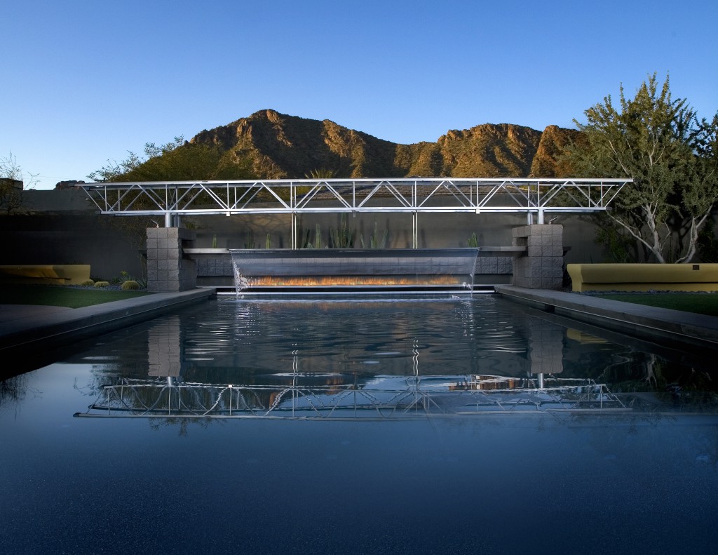
The structural truss from which the spanning aqueduct is suspended keeps the weir perfectly level, borrows from the homes architectural motif, and is an abstraction of the mountains beyond. These composed elements reflect in an ocean blue pebble sheen pool as a striking first impression enjoyed from the front door and main living space.
When you start to harness the power of reflections in your designs, you must first ask, what is it that I will be reflecting? This helps you to prioritize your composition and gives the setting that often-missing sense of visual purpose. The reflections double the visual impact of the most important element that you have chosen, which conveys order and intention. There’s a reason for being there. You capture that content, that visual narrative, so to speak, by where you place the pool and how you shape and frame the water’s surface. If, for example, there’s a soaring hillside adjacent to the property, one could position the water to bounce the eye to the vista beyond. Or the mirrored surface could provide a reflective view corridor to direct the eye to key focal points seen from inside the home or other desirable destinations in the surrounding deck and landscape.
By positioning and capturing the reflection relative to key viewing areas, you are choreographing the visual movement through the space, controlling the experience and emotional impact of simply letting your eyes, mind and spirit wander.
This 360 overflow vessel creates a mirrored first impression when entering the courtyard. It reflects a diagonally placed ironwood tree whose sculptural embrace now canopies the space several years later.
Using reflections also means you can influence where people travel with their feet. In the simplest terms, on one side of the pool looking from the house, you might capture reflections of surrounding trees or other natural features. But when you move to the other side of the water and look back, you’ll capture a reflective image of the house. What you are asking people to fi x their gaze upon will lead them to walk toward that subject. Thinking about reflections causes us to think about those key focal points and organize the space so that moving through the landscape rewards the viewer as it unfolds around them.
JEWELS FOR THE EYES
As mentioned above, pools and hardscape are like the setting in a diamond ring. The diamond, the jewel that gives purpose to the setting, is the specimen plantings. I go to great lengths to choose specific trees and other plants for their sculptural qualities to make strong visual statements. These focal elements in the landscape work in harmony with the pool and should not be an afterthought or a place to slash the budget. Go light in other areas that can grow or be added over time if need be, but to get the most out of the visual music you are trying to compose, make sure your plantings are powerful. Here in Arizona, we have a plethora of fascinating plant species that quite often have a beautiful sculptural quality.
High contrast, primary colors and a bold 4-inch cantilevered coping accentuate this reflecting pool, capturing sunsets and an olive tree silhouetted within in its frame.
Again, reflections play a key role in the way they elevate the role of the plantings, from ordinary space fillers you easily overlook to art pieces worthy of our admiration. When you position a specimen relative to the water’s surface this way, and draw out its beauty that we otherwise take for granted, you create a powerful emotional impact by causing us to pay attention to things that are around us all the time. That effect can be enhanced even more at night when the landscape lighting comes on and dramatically accentuates the form and texture of our key plantings.
The imposing retaining wall was painted dark so as to recede, allowing an array of lightly colored arbors, specimen plantings and pots to pop forward as a lyrical backdrop motif. Here we see the lesser reflective potency of sea foam green played here for its vivid turquoise hue, which resonates with the ochre of the rusted steel planters.
Intentionality. Impact. That is what will come to your work when you incorporate the power of reflections. When you put some deliberate thought into making the most of water’s reflective qualities you’re likely to find a design element that can add tremendous interest and value to any aquatic setting.
This article was originally featured in Aqua Magazine’s July 2017 issue.
Would you like a complimentary copy of Kirk Bianchi’s 32 Design Principles?
This book of principles captures the elusive qualities that separate what is esteemed from the mundane. They elevate even simple projects to an art form.
Those who have studied the arts know these fundamentals; yet the finesse of implementing these insights consistently takes rigorous application few have attained. The masters integrate them intuitively and now you can have them at your fingertips.