A key characteristic of memorable outdoor living spaces is that they have what we can loosely call a strong “sense of place.”
The elements that contribute to this sense of place are things that give enclosure, taking the vast, undefined outdoors and carving “rooms” into it, spaces that impart a feeling of containment, even though they are outside.
As you are designing the outdoors, it’s vital to include elements that speak to this sense of containment. Doing so satisfies our primal need for privacy, security, and protection.
What do outdoor spaces lack that the indoors have? Ceilings and walls.
Our clients, even if they do not have the self-awareness to ask directly, are expecting pool designers and contractors (who tend to be specialists in just one facet of the tapestry) to deliver complete outdoor experiences. Of necessity, this requires multi-disciplinary expertise to bring this to pass. Pool designers who work in a vacuum are preoccupied with the ground plane, and if you sample a thousand images of the best work online, you will find that most of them have unresolved backgrounds that steal attention from the foreground elements.
So, if you want to be a better “pool designer,” you will need to borrow the big picture concepts from the world of landscape, architecture, interior design, and lighting into your purview. The balance between these contributing arenas is essential for making the magic happen in a cohesive way. Often the clients call a pool contractor first, so if you are one of these “first responders,” it’s essential for you to expand your skills and insights into these adjacent realms, or team up with those that do!
That’s a lot to ask, and an overwhelming proposition, since each of these areas can be a full-time endeavor by themselves. So, let’s focus on the high-level concepts.
The subject at hand today is designing the vertical elements around the yard.
These vertical features are significant because they are the implied (or literal) walls of the outdoor room.
Somebody early on has to ask, what is going on at eye level around the perimeter of the yard? I want to point out the significance of “eye level.” See diagram A.
We look THROUGH space to that which is beyond. The eye level elements on the other side of the yard are exactly where our eyes go to first. In small spaces especially, many yards are enclosed by site walls that scribe a hard line at eye level all the way around, with your “box” of space-occupying what is in this area below the line, and everybody else’s stuff beyond is above this line. It’s a hard defining line that needs to be dissolved and softened to not be so abrupt.
First, are there distracting elements above this line that need to be blocked, or views to preserve? Once you come up with a strategy for designing the vertical elements around the yard, you will realize that it’s essential to have a budget to bring these to pass. The pool itself can be simple, if you have a beautiful background. Said differently, don’t overspend on trick pool features if you haven’t yet resolved the background.
Even in an idyllic setting where the entire perimeter is desirable, It’s essential to provide enclosure, in order for each functional space to have an identity and not feel like it’s floating adrift.
Let’s look at a few examples to illustrate these principles.
In larger spaces, trees can be used to create rooms. In smaller spaces where the diameter of the canopy would not fit, we have to use thinner profile strategies.

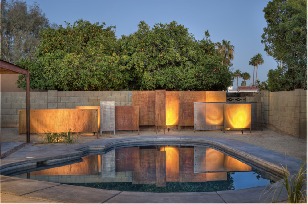
The first image was contributed by my friend and colleague Eric Spry, a residential architect here in AZ. Eric had been designing a home renovation, and they did not have a budget to do much with the pool itself. What could make the most impact? I advised, “Simply create a sculptural pool equipment screen wall that does more than hide the pool equipment. Have it span the length of the wall and be of various heights and materials and put some lighting on it. It will serve as an art piece reflected in the pool.” His solution of rusted steel and perforated panels was inexpensive and did just what was needed. Note the tallest panels break the line of the surrounding masonry wall. I share this to show, it doesn’t have to be complicated or expensive to employ this strategy.


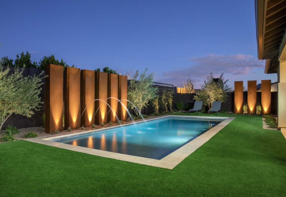
In the Paulos example, note how simple the pool is. It’s just a rectangle with 3cm coping. The dollars were spent on the rusted steel panels that wrap around the yard, that create a 3D sculptural array. The panels pull your eye forward off the background wall (painted a dark color to recede into the shadows) and keep your eye from getting stuck on neighbors’ rooflines beyond. Less costly options of the same height and scale were presented (masonry with stucco and paint, or steel frame faced with wood slats for instance) but the client loved the vibrance of the rust esthetic and how it responded to uplighting at night.

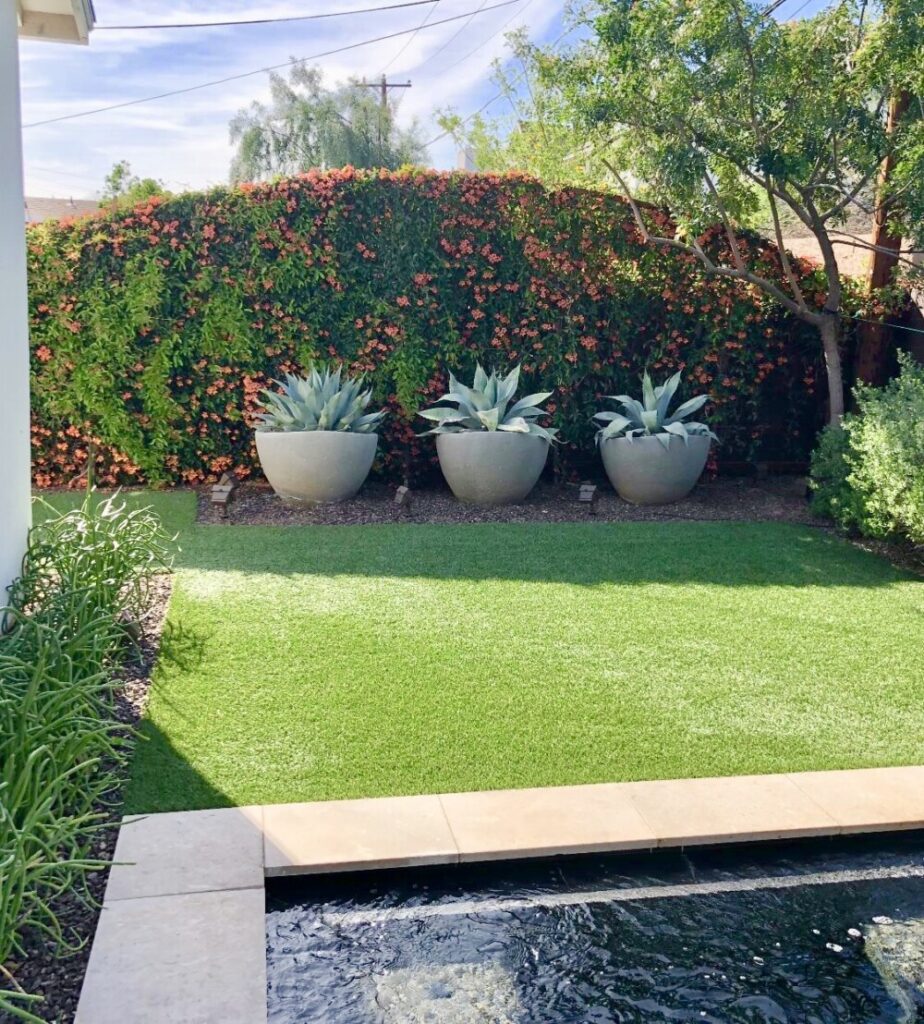
At the Chapman residence, the pool was defined by the powerline setback. The shallow yard had an imposing oleander hedge on the opposite side, that was spilling into the space and felt a bit like a tidal wave. It needed to be counterbalanced with an opposing force that also served as a visual backdrop. The multilayered wall (with just a 2” offset in the two panels) has a curving profile that helps direct the eye to the left and the right through the space. A cantilevered bench creates a 30’ long sitting space in the narrow firepit area. At the far end of the yard, a steel trellis with the same arching top profile supports a red blooming crossvine, which contrasts nicely with the grey green whale’s tongue agave. The height of the trellis was set to obscure the neighbor’s house beyond The accent color in the main wall was taken from the agave.

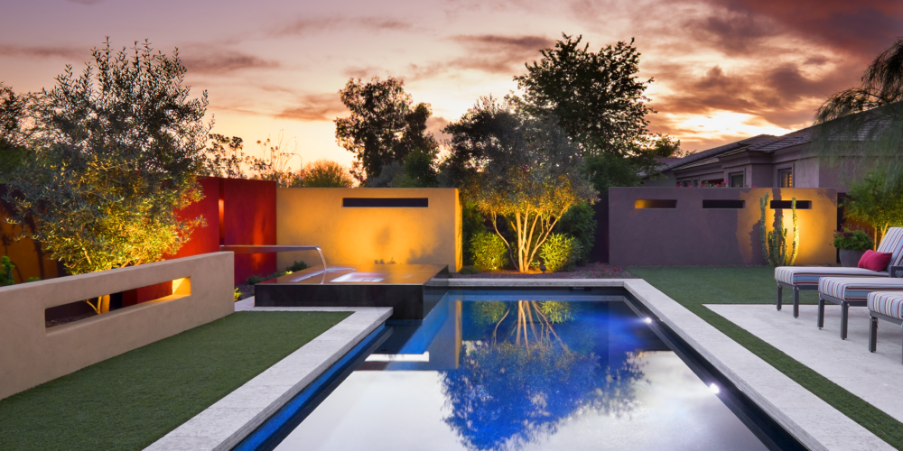
For the Aguirre residence, setbacks required that the pool equipment had to be in the yard (and not on the narrow side of the house). The screen wall (the light-yellow wall behind the spa) was going to be a prominent element, so may as well make it interesting. The client was from Mexico City so we had fun with Barragan inspired masonry accent panels around the yard. Note they are all slightly higher than the property wall, getting the height above eye level, breaking the monotony of the perimeter wall, so it’s not a continuous element.


At the Dady project, stone wall features were interwoven into the architecture of the home to “bookend” both sides of the yard. At the pool end, the wall was projected out as a fin wall with a nicely designed “feature” door. The fin wall hides an unsightly mechanical area just behind, and the feature door provides access. The fin wall diminishes in height and becomes a raised planter at the end of the pool that provides the planter for the focal ironwood tree. (If you look closely, you’ll see a railing that leads down to what? A sunken pool bath and shower area!) At the opposite end, a retractable art piece hides a flat screen TV. An overhead trellis creates a half in half out “bistro” area (for the outdoor kitchen hidden beyond.) The beam projecting from the stone wall of the house provides a picture frame of the mountains beyond and as you pass through this “portal” from the kitchen area to the main pool deck, you feel like you have passed from one room to another.


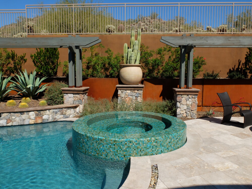
For the McIntosh Residence remodel, the site is an excavated below grade lot with an imposing 12’ tall retaining wall. The previous design tried to dissolve the wall with a pile-o-rock waterfall and random plantings. The solution I provided was inspired by a depth of field trick from photography. If you focus on something just in front of something else, the element in the back becomes blurry and irrelevant. An array of arbors around the yard gives the eye an element to land on, pulling your eyes forward and off the background wall, that is still right there. Note the wall is painted dark, to recede, while the rusted steel clad planter wall is a mid-tone color. The arbor beams are slightly lighter, so they pop off of the background that is only a few feet back. The pots are the lightest elements, as the main feature between the arbors. The symmetry of the spa with the pot pedestal and flanking arbor on either side is on axis with your line of sight from the front door. At the far end of the yard, the arbor and a strategically planted tree join forces to obscure the neighbor’s roofline beyond.

